Bootstrap 入力グループ
この記事では、Bootstrap フレームワークの入力グループについて説明します。入力グループの概念、使用方法、コード例、パラメーターの説明などを提供し、開発者が入力グループをすばやく習得できるようにします。
1. 入力グループとは
入力グループとは、入力フィールドとボタン、ドロップダウンメニューなどの他の要素を組み合わせて、フォームのインタラクティブ性と機能性を高めるものです。一般的な用途としては、検索ボックス、タグ入力、日付選択などがあります。
2. 基本的な入力グループ
基本的な入力グループを作成するには、.input-group クラスを使用します。前置要素と後置要素を追加するには、それぞれ .input-group-prepend クラスと .input-group-append クラスを使用します。
<div class="input-group">
  <div class="input-group-prepend">
    <span class="input-group-text">@</span>
  </div>
  <input type="text" class="form-control" placeholder="ユーザー名">
</div>
3. 入力グループのサイズ
入力グループのサイズを変更するには、.input-group-sm クラス、.input-group-lg クラスを使用します。
| サイズ | クラス |
|---|---|
| 小 | .input-group-sm |
| 標準 | なし |
| 大 | .input-group-lg |
<div class="input-group input-group-sm mb-3">
  <input type="text" class="form-control" placeholder=".input-group-sm">
</div>

<div class="input-group mb-3">
  <input type="text" class="form-control" placeholder="標準サイズ">
</div>

<div class="input-group input-group-lg">
  <input type="text" class="form-control" placeholder=".input-group-lg">
</div>
4. チェックボックスとラジオボタン
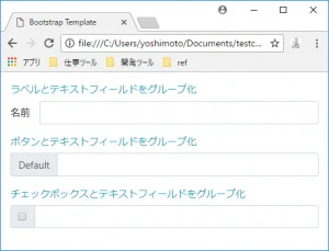
チェックボックスとラジオボタンを入力グループ内で使用するには、.input-group-text クラスで囲みます。これにより、適切な配置とスタイルが保証されます。
<div class="input-group">
  <div class="input-group-prepend">
    <div class="input-group-text">
      <input type="checkbox" aria-label="チェックボックス">
    </div>
  </div>
  <input type="text" class="form-control" aria-label="入力">
</div>
5. 複数のアドオン
入力グループには、ボタンとドロップダウンメニューを組み合わせるなど、複数のアドオンを含めることができます。
<div class="input-group">
  <div class="input-group-prepend">
    <button class="btn btn-outline-secondary dropdown-toggle" type="button" data-toggle="dropdown" aria-haspopup="true" aria-expanded="false">
      ドロップダウン
    </button>
    <div class="dropdown-menu">
      <a class="dropdown-item" href="#">アクション</a>
      <a class="dropdown-item" href="#">別のアクション</a>
      <div class="dropdown-divider"></div>
      <a class="dropdown-item" href="#">何か他のアクション</a>
    </div>
  </div>
  <input type="text" class="form-control" aria-label="入力">
  <div class="input-group-append">
    <button class="btn btn-outline-secondary" type="button">ボタン</button>
  </div>
</div>
6. カスタムコントロール
.custom-file、.custom-select などのクラスを使用して、入力グループの追加要素としてカスタムHTML要素を使用できます。
<div class="input-group">
  <div class="input-group-prepend">
    <span class="input-group-text" id="input-file-addon">アップロード</span>
  </div>
  <div class="custom-file">
    <input type="file" class="custom-file-input" id="input-file" aria-describedby="input-file-addon">
    <label class="custom-file-label" for="input-file">ファイルを選択</label>
  </div>
</div>
関連Q&A
- Q: 入力グループ内の要素の幅をどのように調整しますか?
A: 入力グループ内の要素の幅を個別に調整することはできません。ただし、.col-*クラスを使用して、入力グループ全体をグリッドシステムに配置することができます。 - Q: 入力グループに複数の入力フィールドを含めることはできますか?
A: いいえ、入力グループには1つの入力フィールドのみを含めることができます。複数の入力フィールドを使用する場合は、複数の入力グループを作成する必要があります。 - Q: 入力グループのスタイルをカスタマイズするにはどうすればよいですか?
A: 入力グループのスタイルをカスタマイズするには、独自のCSSルールを作成します。.input-group、.input-group-prepend、.input-group-appendなどのクラスをターゲットにすることができます。