Bootstrap5 ボタン グループ
Bootstrap5 のボタン グループは、複数のボタンをまとめてグループ化し、視覚的にまとまりのあるコンポーネントを作成するために使用します。これにより、ユーザーインターフェースの使いやすさと視覚的な魅力が向上します。
基礎
基本的なボタン グループ
最も基本的なボタン グループを作成するには、.btn-group クラスを親要素として使用し、その中に複数のボタンを配置します。
<div class="btn-group" role="group" aria-label="Basic example">
  <button type="button" class="btn btn-primary">左</button>
  <button type="button" class="btn btn-primary">中央</button>
  <button type="button" class="btn btn-primary">右</button>
</div>
混合ボタン グループ
ボタンだけでなく、ドロップダウンや入力フィールドなどの他の要素もボタン グループに含めることができます。これにより、より複雑なコンポーネントを作成することができます。
<div class="btn-group" role="group" aria-label="Basic mixed styles example">
  <button type="button" class="btn btn-danger">左</button>
  <button type="button" class="btn btn-warning">中央</button>
  <div class="btn-group" role="group">
    <button id="btnGroupDrop1" type="button" class="btn btn-success dropdown-toggle" data-bs-toggle="dropdown" aria-expanded="false">
      ドロップダウン
    </button>
    <ul class="dropdown-menu" aria-labelledby="btnGroupDrop1">
      <li><a class="dropdown-item" href="#">ドロップダウンリンク</a></li>
      <li><a class="dropdown-item" href="#">ドロップダウンリンク</a></li>
    </ul>
  </div>
</div>
サイズ
.btn-group-* クラスを使用して、ボタン グループ全体のサイズを変更することができます。利用可能なオプションは sm (小) と lg (大) です。
<div class="btn-group btn-group-sm" role="group" aria-label="Small button group">
  ...
</div>

<div class="btn-group btn-group-lg" role="group" aria-label="Large button group">
  ...
</div>
ネスト
より複雑なレイアウトを実現するために、ボタン グループをネストすることができます。これにより、ドロップダウンや分割ボタンなどの高度なコンポーネントを作成することができます。
<div class="btn-group" role="group" aria-label="Button group with nested dropdown">
  <button type="button" class="btn btn-primary">1</button>
  <button type="button" class="btn btn-primary">2</button>

  <div class="btn-group" role="group">
    <button id="btnGroupDrop1" type="button" class="btn btn-primary dropdown-toggle" data-bs-toggle="dropdown" aria-expanded="false">
      ドロップダウン
    </button>
    <ul class="dropdown-menu" aria-labelledby="btnGroupDrop1">
      <li><a class="dropdown-item" href="#">ドロップダウンリンク</a></li>
      <li><a class="dropdown-item" href="#">ドロップダウンリンク</a></li>
    </ul>
  </div>
</div>
垂直方向のボタン グループ
デフォルトでは、ボタン グループは水平方向に配置されますが、.btn-group-vertical クラスを使用することで、垂直方向に配置することもできます。
<div class="btn-group-vertical" role="group" aria-label="Vertical button group">
  <button type="button" class="btn btn-primary">ボタン</button>
  <button type="button" class="btn btn-primary">ボタン</button>
  <button type="button" class="btn btn-primary">ボタン</button>
</div>
ツールバー
複数のボタン グループをまとめてツールバーを作成するには、.btn-toolbar クラスを使用します。これにより、ボタン グループを論理的にグループ化し、より複雑なレイアウトを作成することができます。
<div class="btn-toolbar" role="toolbar" aria-label="Toolbar with button groups">
  <div class="btn-group me-2" role="group" aria-label="First group">
    <button type="button" class="btn btn-primary">1</button>
    <button type="button" class="btn btn-primary">2</button>
    <button type="button" class="btn btn-primary">3</button>
    <button type="button" class="btn btn-primary">4</button>
  </div>
  <div class="btn-group me-2" role="group" aria-label="Second group">
    <button type="button" class="btn btn-secondary">5</button>
    <button type="button" class="btn btn-secondary">6</button>
    <button type="button" class="btn btn-secondary">7</button>
  </div>
  <div class="btn-group" role="group" aria-label="Third group">
    <button type="button" class="btn btn-info">8</button>
  </div>
</div>
参考資料
- <a href="https://getbootstrap.jp/docs/5.0/components/button-group/">Bootstrap5 ボタン グループ</a>
よくある質問
Q1: ボタン グループ内のボタンの色を個別に変更するにはどうすればよいですか?
A1: ボタン グループ内の各ボタンに個別に CSS クラスを追加することで、色を個別に変更できます。例えば、btn-primary、btn-secondary、btn-success などを使用できます。
Q2: ボタン グループをレスポンシブ対応にすることはできますか?
A2: はい、Bootstrap のグリッドシステムやユーティリティクラスを使用して、ボタン グループをレスポンシブ対応にすることができます。例えば、.d-flex、.flex-wrap、.justify-content-* などのクラスを使用できます。
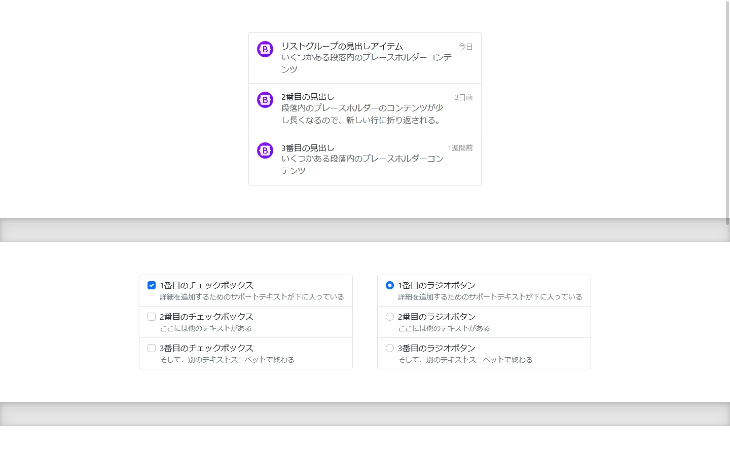
Q3: ボタン グループ内にチェックボックスやラジオボタンを含めることはできますか?
A3: いいえ、ボタン グループ内にチェックボックスやラジオボタンを直接含めることはできません。これらの要素は、フォームコントロールとして設計されており、ボタン グループとは異なる動作をします。