CSS border-image-width プロパティ詳解
この記事では、CSS の border-image-width プロパティについて詳しく解説します。構文、値、実際の適用例、および他の関連プロパティとの併用方法について説明します。豊富な例とわかりやすい説明を通して、border-image-width プロパティを使用して独自のボーダースタイルを作成する方法を完全に習得できるようにします。
目次
- border-image-widthとは?
- border-image-widthの値
- 他のborder-imageプロパティとの関係
- border-image-widthを使ったカスタムボーダースタイルの作成
- ブラウザの互換性
- よくある質問
1. border-image-widthとは?
border-image-width プロパティは、ボーダー画像の幅を設定するために使用されます。
構文:
border-image-width: [ <length> | <number> | <percentage> ]{1,4}説明:
- 幅を指定するには、長さ、数値、またはパーセンテージを使用できます。
marginやpaddingプロパティの短縮形と同様に、1〜4個の値を設定できます。これらの値は、それぞれ上、右、下、左の4方向の幅を表します。- デフォルト値は
1で、ボーダー画像の幅がボーダーの幅と同じになることを意味します。
コード例:
<!DOCTYPE html>
<html>
<head>
<style>
.example {
  border-style: solid;
  border-width: 10px;
  border-image-source: url("border.png");
  border-image-width: 20px; /* 全方向のボーダー画像の幅を20pxに設定 */
}
</style>
</head>
<body>
<div class="example">ボーダー画像付きのdiv要素</div>
</body>
</html>
2. border-image-width の値
- 長さ: 例:
10px、2em - 数値:
border-widthの値に乗算されます。たとえば、2は、ボーダー画像の幅がボーダーの幅の2倍であることを意味します。 - パーセンテージ: ボーダーの幅を基準として計算されます。たとえば、
50%は、ボーダー画像の幅がボーダーの幅の半分であることを意味します。
コード例:
.example1 { border-image-width: 15px; }       /* 長さ */
.example2 { border-image-width: 1.5; }        /* 数値 */
.example3 { border-image-width: 75%; }        /* パーセンテージ */
3. 他の border-image プロパティとの関係
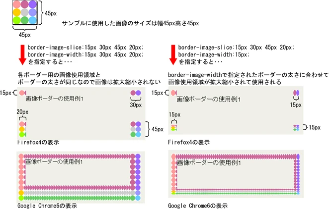
border-image-widthは、border-image-source、border-image-slice、border-image-repeatなどのプロパティと組み合わせて使用して、ボーダー画像の表示効果を制御します。border-image-widthを調整すると、ボーダー画像の拡大縮小とトリミングに影響します。
コード例:
<!DOCTYPE html>
<html>
<head>
<style>
.example {
  border-style: solid;
  border-width: 10px;
  border-image-source: url("border.png");
  border-image-slice: 30;
  border-image-repeat: round;
  border-image-width: 20px 10px; /* 上下ボーダー画像の幅を20px、左右を10pxに設定 */
}
</style>
</head>
<body>
<div class="example">ボーダー画像付きのdiv要素</div>
</body>
</html>
4. border-image-width を使用したカスタムボーダースタイルの作成
border-image-width と他の border-image プロパティを柔軟に使用することで、次のような、さまざまな独自性の高い、美しいボーダースタイルを作成できます。
- 角丸ボーダー
- 影付きボーダー
- テクスチャボーダー
コード例:
角丸ボーダー:
<style>
.rounded-border {
  border-style: solid;
  border-width: 10px;
  border-image-source: url("border.png");
  border-image-slice: 30;
  border-image-repeat: round;
  border-image-width: 20px;
  border-radius: 20px; /* 角丸の半径を設定 */
}
</style>
影付きボーダー:
<style>
.shadow-border {
  border-style: solid;
  border-width: 10px;
  border-image-source: url("border.png");
  border-image-slice: 30;
  border-image-repeat: repeat;
  border-image-width: 20px;
  box-shadow: 5px 5px 10px rgba(0, 0, 0, 0.5); /* 影の効果を追加 */
}
</style>
テクスチャボーダー:
<style>
.texture-border {
  border-style: solid;
  border-width: 10px;
  border-image-source: url("texture.jpg"); /* テクスチャ画像を使用 */
  border-image-slice: 30;
  border-image-repeat: repeat;
  border-image-width: 20px;
}
</style>
5. ブラウザの互換性
border-image-widthプロパティは、主要なブラウザで広くサポートされています。- 最新のブラウザの互換性情報については、Can I use ウェブサイト (https://caniuse.com/) を参照してください。
| ブラウザ | バージョン |
|---|---|
| Chrome | 4+ |
| Firefox | 3.5+ |
| Safari | 3.1+ |
| Opera | 11+ |
| Edge | 12+ |
| Internet Explorer | 9+ |
6. よくある質問
-
質問:
border-image-widthとborder-widthの違いは何ですか?
回答:border-widthはボーダー全体の幅を設定し、border-image-widthはボーダー画像自体の幅を設定します。 -
質問:
border-image-widthに複数の値を設定するとどうなりますか?
回答: 値の数は、ボーダーの各辺に適用される幅を決定します。1つの値はすべての辺に適用され、2つの値は上下、左右に適用され、3つの値は上、左右、下に適用され、4つの値は上、右、下、左にそれぞれ適用されます。 -
質問:
border-image-widthを使用して、レスポンシブなボーダーを作成するにはどうすればよいですか?
回答: メディアクエリを使用して、画面サイズに応じて異なるborder-image-width値を設定できます。
まとめ
border-image-width は、個性的なボーダースタイルを作成し、Webページのデザイン性を高めることができる強力なCSSプロパティです。この記事の説明を通して、border-image-width プロパティについてより深く理解し、実際のプロジェクトで柔軟に活用できるようになったと考えています。